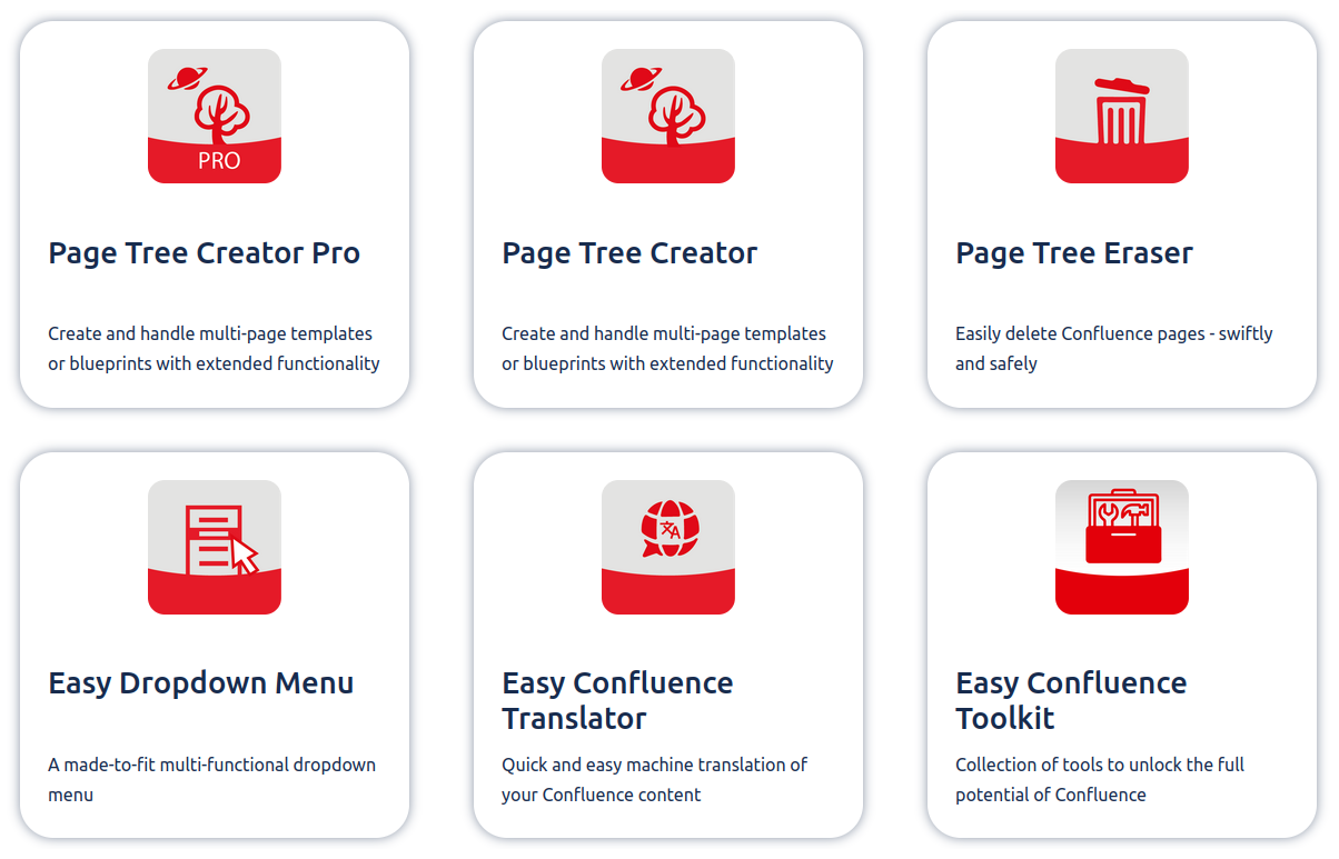
The Card Layouts Macro allows you to freely customize your confluence page and create visually stunning designs.
Macro Configuration
After adding the macro to the page, you can open the configuration by clicking the settings icon in the view mode of the page.
Inside the macro configuration, you can add cards by pressing the + icon and delete them over the trash icon.
By clicking the copy styles button on the bottom right of the configuration, you are able to copy the styles of the currently selected card to all other cards.
The parameters that are copied are:
-
Size
-
Background-color
-
Title-color
-
Text-color
-
Image width
Configure Cards
-
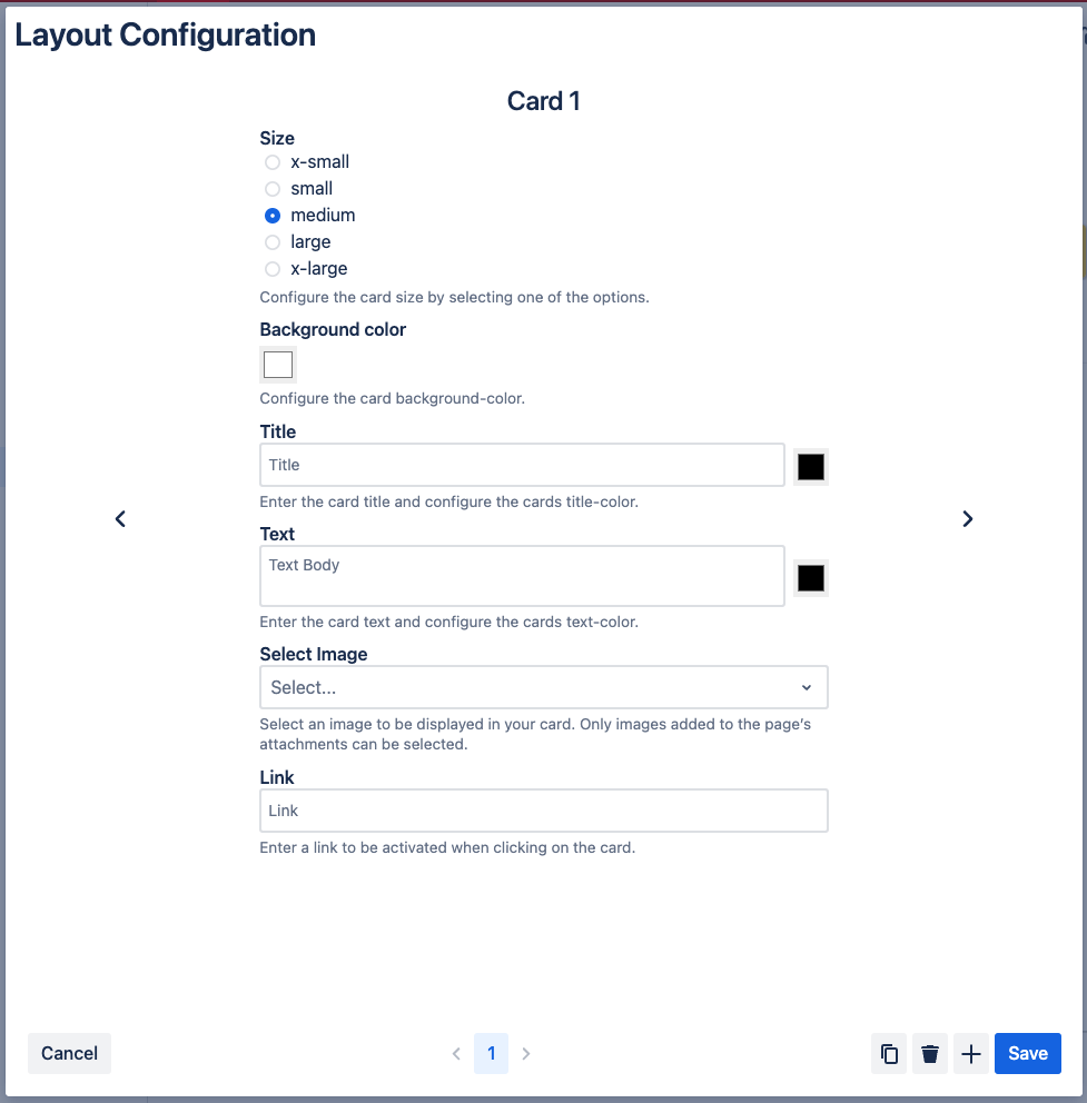
Decide the card size through the first set of radio buttons.
-
Give your card the desired background-color
-
Next, set a title and text for your card.
-
You can also change the text-color for both your title and text.
-
Add an image by selecting one in the image dropdown. You can only choose images that are added to the page’s attachments.
-
If you selected an image, you can also set the image size inside the card.
-
Add a link to your card. This will allow you to navigate to the selected link by clicking on the card.
All cards will have the same height. If a card doesn’t have space in the existing row, it will automatically start a new one.
The settings icon is visible if you have edit permissions on the page. But it is also possible to hide the settings icon for all users. See Macro Editor below for more information.
Macro Editor
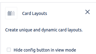
Here you will find a checkbox that allows you to hide the settings icon in the view mode of the page.
Macro Parameters
|
Parameter |
Type |
Description |
Default Value |
|---|---|---|---|
|
Size |
Radio Buttons |
Set the size of the card. |
medium |
|
Background color |
Color picker |
Select the background-color of your card. |
white |
|
Title |
Text-Input |
Enter the card title. |
empty |
|
Title color |
Color picker |
Select the title-color of your card. |
black |
|
Text |
Text-Input |
Enter the card text. |
empty |
|
Text color |
Color picker |
Select the text-color of your card. |
black |
|
Image |
Dropdown |
Choose the image you would like to be displayed in the card. You will have the option between all images that have been added to the page's attachments. |
empty |
|
Image Width |
Slider |
Set the width of the image that is placed in your card. |
100% |
|
Link |
Text-Input |
Set a link that will be navigated to when clicking on the card. |
empty |


